Tuesday, 10 May 2016

Finished Music Magazine Contents Page

This is my completed contents page for my magazine. I have now added the reviews section and have also added the masthead infront of the reviews title, this way the reader will be able to trust us further as they know that all reviews belong to 'HITS' magazine and haven't been written by just anyone. I have added a footer bar and within this bar is the social media logos that we have accounts with i have done this so my target audience can recognize that we are a multi-platform brand and we are expanding to accommodate to the changing society as more and more people are becoming techonophiles, there is also an indication that notes that our social media links are inside the magazine. There is also the date that the magazine has been published and the contents page number, also in the footer is a small masthead before the page number so that it can be recognized as a 'HITS' magazine page. I feel that now my contents page links in with the rest of my magazine so far.
I have added a black border around each side of the contents page, i feel by doing this i have brought the magazine together and made it look a lot neater. I feel that with the added changes it now looks more like a contents page. I have used faint grey lines in between each section so that it breaks the page up a bit but doesn't look hugely untidy and still looks neat.
I have changed a few little details on the page that i wasn't happy with, the biggest one being the color of the front that is beneath the subheadings, it was previously a really light grey and was hardly readable and noticeable so i changed it to a darker grey but still made sure that it was a different color to the subheadings themselves, by doing this i have made a clear definition between the subheading and there previews/pull quotes.
I am personally very happy with how my contents page turned out in the end, although it doesn't look identical to a professional music magazine, i feel i have tried to make it as sophisticated as i can. I have taken certain aspects from professional magazines and then changed and adapted them into my magazine. I have achieved everything i had planned to for the contents page, i have also added little details that weren't in my plan but definitely brought my page together. I feel that maybe the layout could been placed differently but overall i am very pleased with my final contents page.

Music Magazine Contents Page Progress

This is the beginning stage of my contents page. So far i have included a lot of detail, i have done this as i had a clear idea of what i wanted my contents page to look like, this helped greatly as it meant i was able to get a lot done the first time i started working on my contents page. I had previously edited and chosen my images so that they were able to be put straight on to the contents page when i started working on it.
On my contents page i have included the same masthead that i used on the front cover, by doing this i have made the magazine brand consistent and easily recognizable throughout. I have included my slogan beneath the masthead on the page so this also is consistent throughout. I have also situated a thin line going across the top of my page, in the center of this line is a red circle with the issue number located inside it, by doing this i have made it easily readable and recognizable for the readers to locate which issue they are reading.
I have continued the color scheme from the front cover so this also helps make the magazine flow. The biggest image on the contents page is the image of 'Michael Moore' this is because he is the main focus of the magazine, but for this image i again used an image where he was gazing directly into the camera. I feel the masthead on this page stands out hugely as it's so bold and is against a white background which also adds and makes it pop more.
I wanted to include an image of one of our review writers, this way it would help the reader to trust the magazine as they can see that our reviews are 100% real and trustworthy and aren't written by just anyone.
I have included a page number on the image of 'Michael Moore' as it will help the reader to locate the article they would like to read. I feel the images all work well on the page as it breaks up the plain white background but also adds a little edginess to the page.
I feel that i have made the 'features' section big enough and it has plenty of detail within it but it doesn't look overcrowded or cramped together. I feel have used a good range of colors and i feel it would really encourage the readers to purchase the magazine as it has plenty of content for them to read.
Currently it's not quite a contents page so over the next few days i will continue to work on the page and improve and add sections so that i can achieve an overall appealing and readable page that fits in with the rest of my magazine pages.

Monday, 9 May 2016

Music Magazine Contents Page Image Options

Planning Document For Images

Shoot Date And Time ; 3rd February 2016

Image Description; Medium close up or medium shot of Michael Moore, feature artists and the review journalist.

Shoot Location; My house, against a cream background, against a brick wall and against a white wall.

Model/Personal Contact Details; Jordan Jones (mobile number), Megan Webb&Megan Griffiths (mobile number), Eleanor Binley (mobile number)

Permission Details; Yes off all.

Props; *None Used*

Plan Of Shots; All models to look directly at camera. No poses decided yet, will achieve a look when discussed with the models.


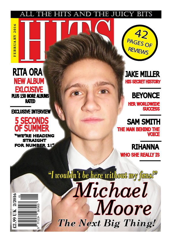
Finished Music Magazine Front Cover

The last thing I have edited on the front cover is the font within the pug, it is the only different font within the page! I did this as i feel it now makes it stand out even more than it did before. I also have adapted the spacing between some of the sell lines, i felt that previously the sell lines were too close together and difficult to read but now they are easily readable and definitely look a lot better.

I have now completed my magazine front cover and feel that there is no more i can do to it and it has been completed to the best of my ability. I feel the front cover definitely stands out and isn't too overpowering or in your face. There is a resemblance to a 'Q' magazine layout and structure but i feel i have put my own twist on it and made the magazine my own.

Music Magazine Front Cover Progress


In the next two hours of working on my front cover, I managed to add a splash and the sell lines on either side of the front cover. I find my magazine to be a very conventional layout, but it is very neat and appealing and i feel it is starting to become very eye-catching.
In the first hour I decided on a color scheme and layout for my splash. I decided to use all three of the colors in my color scheme, red, yellow and black. The name of the artist 'Michael Moore. is the biggest section of the splash, with the headline of the article and pull quote are then roughly the same size. By doing this I have achieved an equal amount of attention withdrawal to both parts, this way both sections have catchy titles or quotes which will entice the reader into purchasing the magazine and reading further into the magazine. The colors of the splash are vibrant against the white background and all compliment each other to achieve an eye-catching front cover.
In the second hour i added the sell lines to either side of the front cover. Throughout the front cover I used the font Bondi MT and continued to stretch it out and mess around with it within InDesign, by doing this i ensured that the front cover was consistent all over.
The sell lines are also consistent all over the front cover with bold black headlines in block capitals with red pull quotes and subheadings beneath it, there are also small black lines separating each headline (article feature) so that each one is easily identifiable and doesn't get confused with another. I have also used the names of well known artists so that it can add to attracting a reader as they will believe that if an unknown artist like 'Michael Moore' is the main focus in a magazine with 'Beyonce' they are more likely to purchase the magazine if that is they're preferred genre of music. I also added a pug to the top right hand side of the magazine where there was dead space, within the pug is a pull quote that will entice the reader to read within the magazine fully. The pug is a bold yellow color with a thick black outline and a thinner black font within it. I personally feel the pug stands out a lot as it is a bright yellow and as there isn't much yellow featured on the magazine it would catch the audiences attention more.
I also added a barcode with the short date and price printed on it, this way the audience have a clear idea of the price of the magazine and on which date it was published.
After adding sell lines i can still see the 'Q' representation but i still continue to make it my own personal magazine to avoid copyright etc.

Music Magazine Front Cover Progress


The first change i have made to my front cover is the masthead. I personally didn't feel as though the masthead was drawing enough attention so i altered it. I added a black header bar above the original masthead with my chosen slogan for the magazine in white font and i then further added a yellow box going down the left hand side of the masthead with the published date inside it in black font. I feel that by adding these small details I have achieved a bolder and more eye-catching masthead that will help my magazine cover to be individual and stand out above the rest.
As i add things to my magazine cover I find that I am similarly following the layout and design of 'Q' magazine but also making it my own and adding my own touch so that the two aren't exactly similar.

Music Magazine Front Cover Progress

I have started to work on my front cover for my music magazine. I have chosen this image as i feel it will appeal to the reader more but will also draw them in to notice the magazine. There is definitely a gaze look from the image which keeps the codes and conventions of a magazine. I feel this reflects the mixed music genre as he doesn't have a specific look, he is well dressed and you can't judge which music genre he sings just by looking at the image as he has quite a neutral look.
I have also started to create a masthead, i have decided to use the font Bondi MT in white, within a red box, and then using Photoshop I stretched out the text to make it appear longer and bolder.
Before placing the image onto the magazine cover, I removed the background in Photoshop as i had a clean image to work with. I have also placed the image on a layer above the masthead so that the image would overlap the masthead slightly and dominate the front cover but not too much.
Over the next few weeks i will continue to work on and improve my front cover to the best of my ability to produce the final piece.